
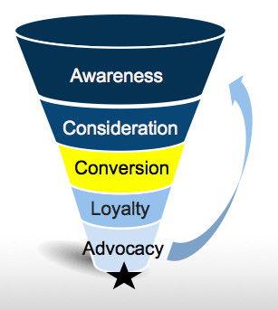
In this series of blog posts, we’re examining the e-commerce conversion funnel from Awareness to Advocacy. Last time I discussed how to gain customer consideration through relevant content. This followed the previous week’s post covering how to increase awareness for your online store.
 Once you’re generating interesting content, bringing people to your store, and providing your users all of the information they need to purchase, they’ll be lining up to pay. Now, it’s important to make their checkout experience as seamless as possible in order to increase conversion rates.
Conversion:
Brick-and-Mortar: Customer goes to cashier and pays
Online: Customer adds items to the basket, fills out registration, billing, and shipping information, and places order
How to optimize this? Better User Experience with Fewer Steps
1) Collect Data
Before you start anything else, make sure that you’re tracking your traffic and conversion rates. This will give you a basis for comparison and allow you to mark your progress toward your conversion goals.
Tools
Google Analytics is a powerful tool. There’s an entire academy and even a certificate for it and describing all of its features would take up dozens of blog posts. But, for our purposes, among its many uses is the ability to track your site’s traffic and conversions. Here’s a quick tutorial on how to set up the conversion tracking. If you have WordPress, here’s a free plugin to display the analytics in your WP dashboard. If you use Shopify, check out this guide instead.
Free for these purposes (Premium version also available)
Crazy Egg shows you what your users are doing on your site through maps that display what they have seen and where they have been clicking. If you register for their service and use WordPress, be sure to download their plugin, which shows you the analytics in the WP dashboard.
Prices range from $9/month to $99/month.
With MixPanel you can create funnels with a series of events that you want to track. Then, the data will show you where your customers drop off between steps allowing you to monitor any process. This is useful for example to A/B test your different landing pages and see where most of your customers are coming in as well as how long it takes for them to go through the funnel. You can then see if there has been any change in the funnel over time.
KissMetrics is quite similar to MixPanel, but doesn’t show real-time analytics. There are blog posts detailing the differences, but if you don’t need real-time data, then it’s more of a matter of taste. Want to try them both? Then, you can try Segment.com’s data collection and re-routing service so that you don’t have to do the integration process twice.
14-day free trial, then goes from $200/month to $2,000+
2) Analyze Checkout Process
Once you have an analytics system setup and a baseline established, go through each step of checkout process to see where bottlenecks may be occurring.
In general, your checkout process should:
- Have a minimal number of steps that are as simple as possible
- Be completely linear (no redoing steps),
- Exclude repetitive information, and
- Include a progress bar.
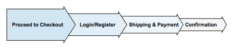
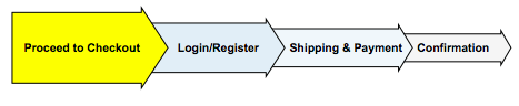
2.1) Proceed to Checkout
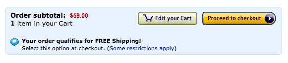
This is your last chance to upsell or cross-sell, which may help increase revenue to your store, but make sure that these efforts don’t inhibit your customers from completing their purchase. Focus on clear directions for them to continue. Don’t insert a button stating, “Continue” as this could be misinterpreted as “Continue Shopping.” Instead, have the button clearly state “Continue to checkout” or “Proceed to checkout.”
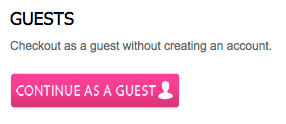
2.2) Login / Register
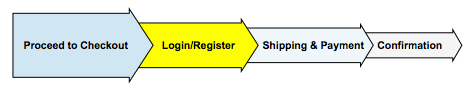
Let your users continue as a guest. A lot of users get to this point in the page with the singular goal of seeing how much shipping will cost. They don’t want to spend the time filling out a registration form that we won’t use later on. So do them this favor.
If users do register, in the registration page, make your newsletters opt-in and not opt-out. Whatever you do, don’t make it an automatic opt-in. Being seen as spam is a great way to drive away customers.
2.3) Shipping & Payments
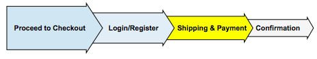
Remember that the goal here is to make the checkout process as quick and painless as possible. With that in mind, keep this one form as short and easy to fill as possible.
- Automatically fill in information that the user has already inserted: For example, if the user has registered, automatically fill in the shipping and payment information for them so that they merely have to verify the information. Put the payment information first and automatically fill in the shipping information to be the same as the payment information, but allow your users to uncheck this option to remove the information.
- Hide fields that are unnecessary: If the user has chosen to pay by PayPal, then there is no reason to show a credit card form. Hiding this until the user clicks to pay by credit card cleans up the page and keeps the user from being overwhelmed.
- Add descriptions to the form field labels: For email, tell your users how you will use this email. What is address line 2? What is CVV? What is VAT?
- Address security concerns: Make sure that your checkout process is secure and that your users know this. Displaying security seals helps to reassure them.
2.4) Confirmation
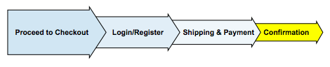
Finally, give the user a second chance to confirm the shipping and payment information before proceeding. Then, send them a receipt/confirmation email.
3) Examine data
After you have examined and optimized the checkout process and you have a few clients checking out, then examine the data that you have been gathering. View the percentage drop off from each step and troubleshoot as to why this could be happening. The best practice is to go through the process yourself or with a friend to see what could be happening. Possible other bottlenecks are:
- Page loads too slowly
- Page doesn’t work in all browsers or on all devices
- Directions are unclear as to where to go next
If the user does abandon his/her cart…
4) Cart abandonment
If you still can’t figure out why customers are leaving their carts empty, the next best thing to do is to ask them. Install an app such as AbandonApp by MoonMail, which automatically sends emails to the customer who abandoned their cart.
It runs from free (10 emails) to $99/month (unlimited emails)
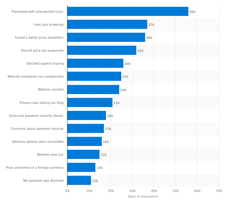
Learn from others’ experience. Statista surveyed e-commerce customers to find out why they abandoned their shopping cart and found the following reasons:
Summary
If there’s one thing you should get out of this post it is this:
– Make the checkout process as quick and painless as possible, with the fewest steps and least amount of information necessary to be entered. Track your users’ movements through an analytical software and check to see where the bottlenecks are appearing.
What analytical software do you use to analyze your checkout process? Do you have any best practices that you’d like to share?
Comment below!
Interested in knowing more about Dark Social & Analytics?
[su_button url="https://getsocial.io" target="_blank" style="flat" background="#21D2B5" color="#ffffff" size="7" wide="no" center="yes" radius="auto" icon="" icon_color="#FFFFFF" text_shadow="none" desc="" onclick="" rel="" title="" id="" class=""]SIGN UP FOR FREE[/su_button]