At GetSocial, we know just how important numbers are.
It’s hard to argue against accurate data and, therefore, easy for people to care about it, whether it shows good or bad news.
While anyone can make a decent guess about what strategy or content is working best, there’s nothing like having the security of numbers to back you up.
We know how especially important this is for marketers and audience developers, who work tirelessly to understand their analytics and reach insights that will help them and their teams make better decisions.
But we also know that, oftentimes, these are the people who also get most frustrated by data.
Let’s be honest, we’ve all sighed in defeat after opening a CSV file, right? It’s not always the most appealing sight.
Although most people can recognize the value of analytics, a lot of us still dread having to open a dashboard and make sense of thousands of numbers.
And understandably so!
Working with numbers and having to make decisions based on them can be a hard task. With so much to keep track of, reaching actionable insights takes a lot of time and patience that is often being spent somewhere else.
Bottom line: analytics dashboards can be overwhelming.
Still, we know how crucial it is to cultivate a data-driven mindset for marketing teams, audience developers, editors, etc.
How can we make our customers care about data?
While intuition should not be fully dismissed, decisions that are based on cold hard numbers provide more security to the decision-making process.
This thought process has led us to consider how we can encourage our users to get more value from the data they see in GetSocial.
For the past few months, we’ve been working hard to figure out how to present data to our users in a more easily-digestible way.
Sure, it’s always been possible to download a spreadsheet with thousands of numbers. But we know that, in order to encourage more data-driven mentalities, we need to give our users the means to easily see beyond the numbers.
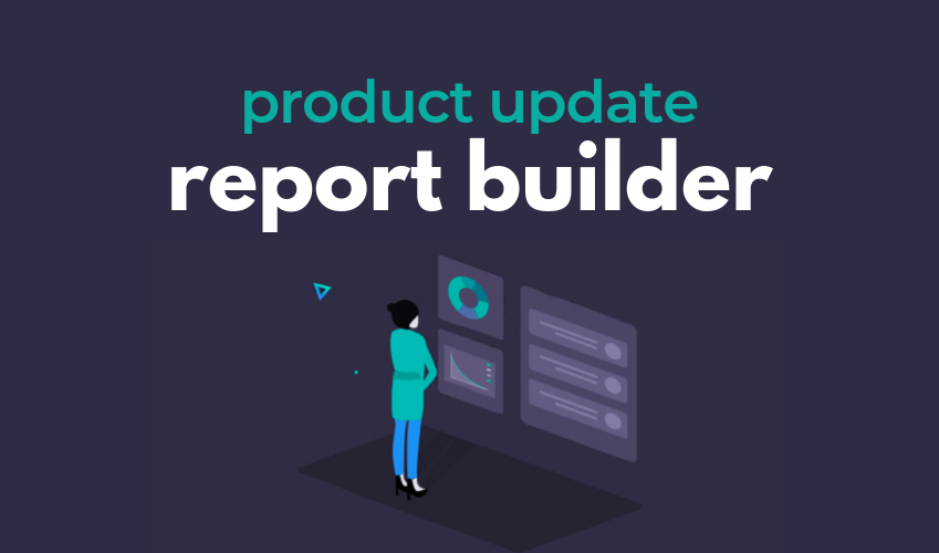
That’s why we’re introducing a Report Builder.
A lighter, easier & faster way to understand data
Our new Report Builder gives users a chance to customize reports that are automatically delivered to their emails on a daily, weekly and/or monthly basis.
Beyond simplified data visualization, the most important aspect of our reports is that they come filled with automated insights.
You no longer have to rummage through the numbers hunting for the perfect one-line conclusion to present to your team.
In fact, the report was designed to give users the feel of a presentation that they can use at their next meeting to share with their team.
This means you can easily start discussing results and strategies with your team, without having to previously spend hours exploring the platform to find all the “a-ha!” moments.
By including insights taken from each feature, such as Top Channels or Top Locations, we hope our users can quickly identify new trends and opportunities for their businesses.
You can include the following information (Data Sources) in your reports:
- Dashboard
- Top Stories
- Top Channels
- Top Locations
- Top Authors
- Top Sections
You can choose to aggregate everything into one file (PPTX and/or PDF) or schedule specific sources for a certain day and time.

We’re really excited to introduce this new feature to our customers and encourage them to see the full value of their data.
You can learn more about how to make and schedule reports in our Knowledge Base article.
*The Report Builder feature is available to customers on the Grow, Expand and Enterprise plans.
Interested in knowing more about Dark Social & Analytics?
[su_button url="https://getsocial.io" target="_blank" style="flat" background="#21D2B5" color="#ffffff" size="7" wide="no" center="yes" radius="auto" icon="" icon_color="#FFFFFF" text_shadow="none" desc="" onclick="" rel="" title="" id="" class=""]SIGN UP FOR FREE[/su_button]
